logo contest entry for Schirn Kunsthalle Frankfurt”/
art exhibition on “peace”
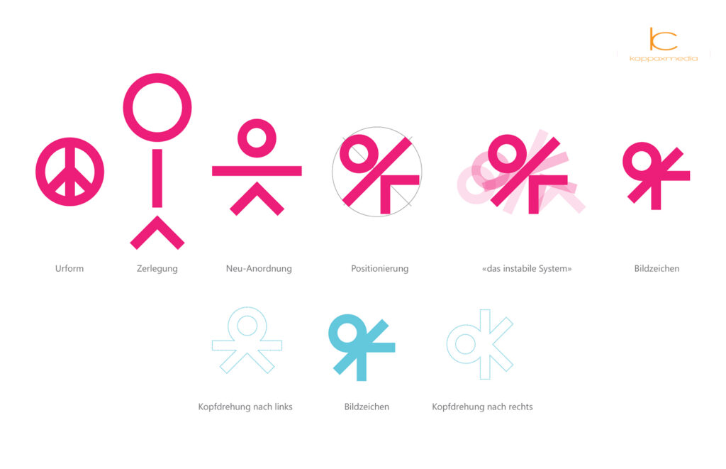
What we know today as the peace sign is a mixture of a circle and the integration of N and D from the waving alphabet. We no longer associate it with „Nuclear Disarmament“, but it has become a symbol for peace and freedom worldwide.
The evolutionary design dissolves the peace sign into its components and rearranges them.
- Circle: world, community, consensus, harmony, ultimately what we strive for.
- Straight: the protection of outstretched arms, solidarity, freedom
- Angle: the decision between two alternatives, depending on the direction of view also stability or disturbance from outside.
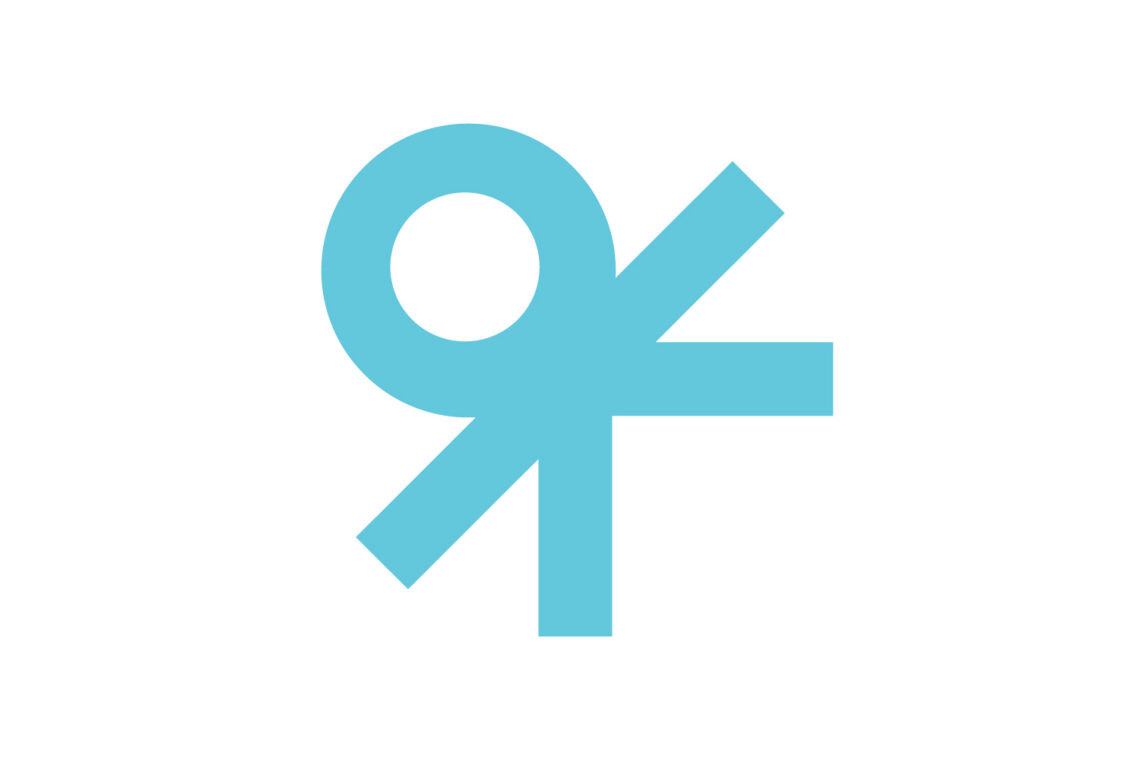
The rearrangement of the elements illustrates that the system is not balanced, but vulnerable and quite unstable. The circle is not in a state of rest, but threatens to slip; that it nevertheless remains part of the system is the daily Sisyphean work of every citizen of the earth. The star-like pictorial sign is tense in its basic orientation: if you turn your head to the left, the figure comes to rest; if you turn your head to the right, you read „ok“. Thus, probably the best-known expression in the world for something being „good“ is the digitally reproducible subtext for this logo: o|<


